Infographics, while they are a bit overused these days, still represent a great way to package information in a visually engaging way.
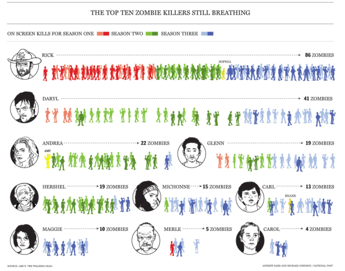
That’s the wrapper I’m using to vaguely explain why this awesome infographic of every Walking Dead zombie kill should be on a marketing blog. Because… content? Also, statistics? Anways, this is sooper important, so just look:
I’m pretty surprised that Hershel has out-slaughtered Carl, and that Carl ranks ahead of Maggie. Step it up, girl.
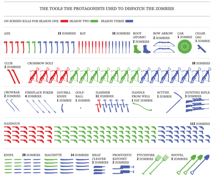
And a person with light OCD tendencies such as myself can’t help but love this careful cataloging of every weapon used in a kill, color-coded by season AND presented in alphabetical order. (Although not sure how “scythe” got where it is… maybe it was a hand-mower at some point?)
Is there more? Oh yes, there’s more. See the whole thing and marvel.
In conclusion: statistics.

